Sahjanand.
A quieter identity can still speak clearly.
Behind the idea.
Meet the brand, understand the creative challenge, discover the idea and explore the work.
Consistency does not mean repetition.
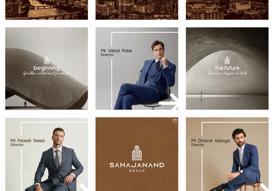
The Sahjanand collection brings social-layout explorations and a physical bag-design application together. It is a compact example of how a visual language can hold across different formats.
The Sahjanand collection contains full-grid social layouts and a final bag design presentation, including blue and monochrome routes. Its strength lies in how small visual choices can create a recognisable whole.
How might a considered identity translate between screen-based communications and print without becoming visually crowded?
Let consistency do the work.
Controlled colours and typography provide the framework. Blue and black-and-white applications demonstrate different moods inside the same system, while the bag design tests how it carries onto a physical object.
How the idea takes shape.
This case study showcases social-grid variations, monochrome and blue studies, and selected pages of the bag-design presentation.
IN THE
DETAILS.
Explore the work through the selected images and close-up details.
Kaari↗