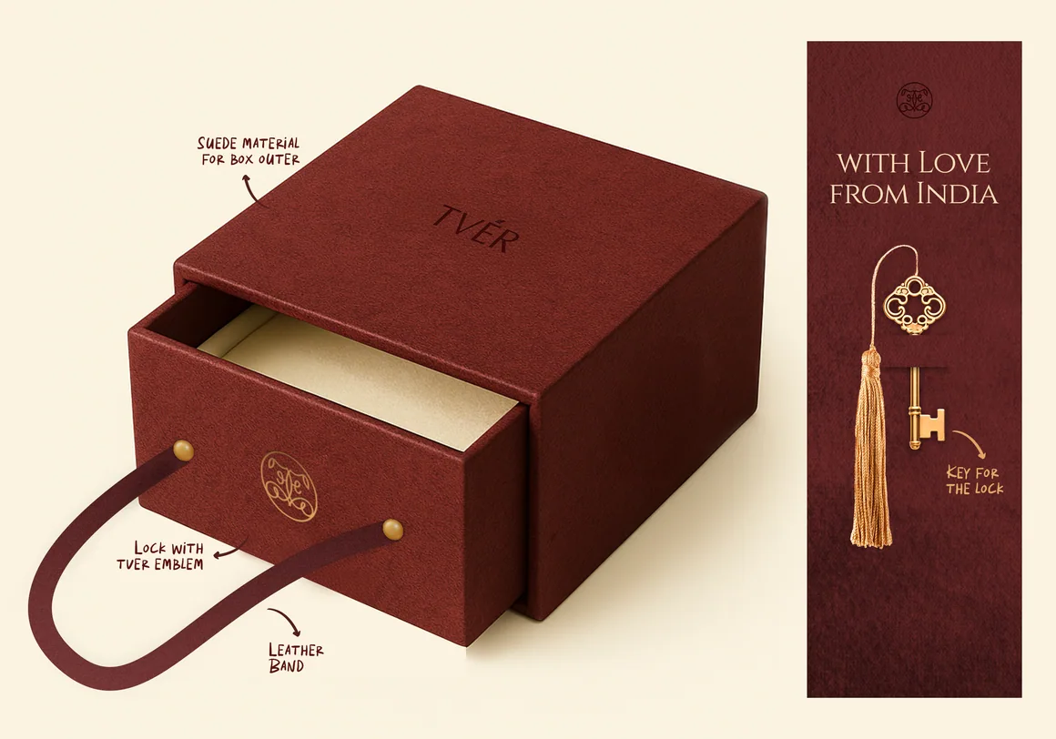
Goodness.
Good on the inside. Distinctive on every side.
Published figure for Gulab Oils (the wider parent business), not for Goodness alone. It is not a result of the packaging project. Source: Business Standard · June 28, 2022
Behind the idea.
Meet the brand, understand the creative challenge, discover the idea and explore the work.
Packaging has more than one first impression.
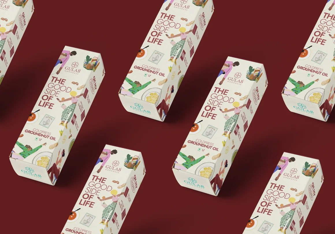
Gulab Goodness is a packaged-food range within the wider Gulab Oils family. This case study focuses on groundnut-oil packaging and how one visual identity can work around an entire pack.
A customer may encounter a product on a shelf, in a close-up image or from an entirely different angle. For a groundnut-oil pack, the identity has to remain legible and appealing after the hero-facing panel ends.
How might Goodness develop a coherent packaging presence that feels recognisable across the front, side, back and presentation mockups?
Let the whole pack carry the identity.
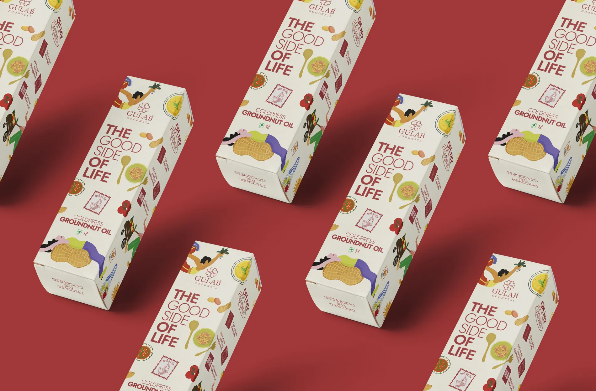
The visual study treats colour, graphic hierarchy and product information as a connected system. Front and right-hand views establish the first impression; back and left-hand applications show what happens when the design wraps around the object. The personality is carried by the entire package rather than by a lone cover image.
How the idea takes shape.
This exhibition includes the cover visual, front/right and back/left groundnut-oil mockups, plus additional packaging presentations. The interactive comparison lets visitors examine two genuine packaging views side by side.
Every angle.
Explore two views of the Goodness groundnut-oil packaging artwork. Drag the handle or use your arrow keys to move between the front/right and back/left presentations.
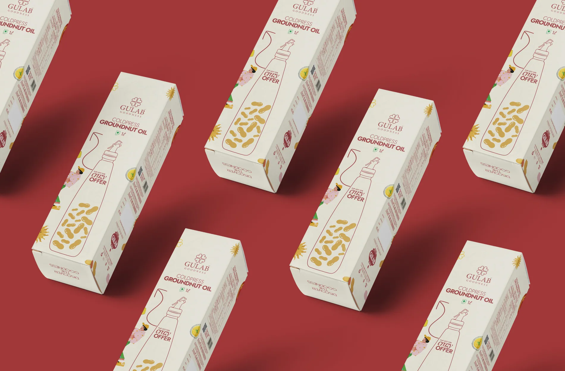 BACK / LEFT
IN THE
DETAILS.
Explore the work through the selected images and close-up details.
TVER↗